In this Step by step Bootstrap Tutorial Lesson 14 - Responsive Tabs with Scrollspy
post, we design in 15 minutes a responsive Bootstrap Tab with Scrollspy , in a from-scratch Application for Mobile devices & desktop computers . All the code is open source at GitHub:https://github.com/CarmelSoftware/Bootstrap_TabsAndScrollspy
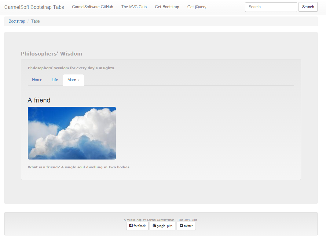
This is how the Responsive Tabs with Scrollspy are displayed:

And this is the App in Nexus Galaxy devices :

Bootstrap Tutorial Lesson 14 - Responsive Tabs with Scrollspy
https://github.com/CarmelSoftware/Bootstrap_TabsAndScrollspy
You can begin building this app from a free Bootstrap template downloaded from www.initializr.com/ (we explained this in a short tutorial: Bootstrap Templates). Elsewhere add to your HTML5 page the following CDN jQuery and Bootstrap references :
<meta name="viewport" content="width=device-width, initial-scale=1">
...and the following scripts before closing the </body> element :
<script src="//ajax.googleapis.com/ajax/libs/jquery/1.11.2/jquery.min.js"></script>
<script src="https://maxcdn.bootstrapcdn.com/bootstrap/3.3.4/js/bootstrap.min.js"></script>
<ul id="myTabs" class="nav nav-tabs">
<li class="active"><a href="#home" id="home-tab" data-toggle="tab" aria-controls="home" aria-expanded="true">Home</a></li>
<li><a href="#profile" id="profile-tab" data-toggle="tab" aria-controls="profile">Life</a></li>
<li class="dropdown">
<a href="#" id="myTabDrop1" class="dropdown-toggle" data-toggle="dropdown" aria-controls="myTabDrop1-contents">More <span class="caret"></span></a>
<ul class="dropdown-menu" aria-labelledby="myTabDrop1" id="myTabDrop1-contents">
<li><a href="#dropdown1" id="dropdown1-tab" data-toggle="tab" aria-controls="dropdown1">A friend</a></li>
<li><a href="#dropdown2" id="dropdown2-tab" data-toggle="tab" aria-controls="dropdown2">Happiness</a></li>
</ul>
</li>
</ul>
<br />
The buttons will open the corresponding "tab-pane fade" , such as the following :
<div class="tab-pane fade" id="dropdown2" aria-labelledby="dropdown2-tab">
<h3>Happiness</h3>
<img class="img-responsive img-rounded" src="..." alt="Alternate Text" />
<br />
<p>Men of the most vulgar type, seem to identify the Happiness with pleasure. (Etics, I ch V)</p>
<p>It is the mark of an educated mind to be able to entertain a thought without accepting it.</p>
</div>


<div class="tab-pane fade" id="profile" aria-labelledby="profile-tab">
<div class="bs-example" data-example-id="embedded-scrollspy">
<nav id="navbar-example2" class="navbar navbar-default navbar-static">
<div class="container-fluid">
<div class="navbar-header">
<button class="navbar-toggle collapsed" type="button"
data-toggle="collapse"
data-target=".bs-example-js-navbar-scrollspy">
<span class="sr-only">Toggle navigation</span>
<span class="icon-bar"></span>
<span class="icon-bar"></span>
<span class="icon-bar"></span>
</button>
<a class="navbar-brand" href="#">Points Of View</a>
</div>
<div class="collapse navbar-collapse bs-example-js-navbar-scrollspy">
<ul class="nav navbar-nav">
<li><a href="#happy">A happy life</a></li>
<li><a href="#Truth">Truth</a></li>
<li class="dropdown">
<a href="#" id="navbarDrop1"
class="dropdown-toggle" data-toggle="dropdown" role="button"
aria-haspopup="true" aria-expanded="false">More About Life <span class="caret"></span></a>
<ul class="dropdown-menu" aria-labelledby="navbarDrop1">
<li><a href="#love">Love</a></li>
<li><a href="#privilege">Privilege</a></li>
<li role="separator" class="divider"></li>
<li><a href="#perspective">Perspective</a></li>
</ul>
</li>
</ul>
</div>
</div>
</nav>
Every <a> button in the Nav will open the corresponding contents, and also, while you navigate from content to content, the corresponding menu will be outlined .
Now for the Scrollspy:
<div data-spy="scroll" data-target="#navbar-example2" data-offset="0" class="scrollspy-example">
<h4 id="happy">A happy life</h4>
<img class="img-responsive img-rounded" src="..." alt="Alternate Text" />
<br />
<p>Very little is needed to make a happy life</p>
...
<h4 id="Truth">Truth</h4>
<img class="img-responsive img-rounded" src="..." alt="Alternate Text" />
<br />
<p>If someone is able to show me</p>
...
<h4 id="love">Love</h4>
<img class="img-responsive img-rounded" src="..." alt="Alternate Text" />
<br />
<p>It is not death that a man should fear</p>
...
<h4 id="privilege">Privilege</h4>
<img class="img-responsive img-rounded" src="..." alt="Alternate Text" />
<br />
<p>You need to avoid certain things in your train of thought</p>
...
<h4 id="perspective">Perspective</h4>
<img class="img-responsive img-rounded" src="..." alt="Alternate Text" />
<br />
<p>Everything we hear</p>
...
</div>
</ul>
</nav>
</div>
</header>

That's all. The entire Tab with Scrollspy will be shown like this:


<link rel="stylesheet" href="https://maxcdn.bootstrapcdn.com/bootstrap/3.3.4/css/bootstrap.min.css">
<link rel="stylesheet" href="https://maxcdn.bootstrapcdn.com/bootstrap/3.3.4/css/bootstrap-theme.min.css">
<script src="//ajax.googleapis.com/ajax/libs/jquery/1.11.2/jquery.min.js"></script>
<script src="https://maxcdn.bootstrapcdn.com/bootstrap/3.3.4/js/bootstrap.min.js"></script>
The latest versions of the Bootstrap files are in this CDN server: http://www.bootstrapcdn.com/
If you need a Mobile device Emulator, read this short tutorial on installing the FREE Ripple Emulator.
1) Designing a Responsive Tab:
Following, we give you all the code to create the Tabs: all this code you just copy-paste inside your page.
Let's start.
We begin by creating the Navbar which allows the user to open the corresponding tabs content . We do so by using the Bootstrap classes "nav nav-tabs" , in order to set the menu :
<li class="active"><a href="#home" id="home-tab" data-toggle="tab" aria-controls="home" aria-expanded="true">Home</a></li>
<li><a href="#profile" id="profile-tab" data-toggle="tab" aria-controls="profile">Life</a></li>
<li class="dropdown">
<a href="#" id="myTabDrop1" class="dropdown-toggle" data-toggle="dropdown" aria-controls="myTabDrop1-contents">More <span class="caret"></span></a>
<ul class="dropdown-menu" aria-labelledby="myTabDrop1" id="myTabDrop1-contents">
<li><a href="#dropdown1" id="dropdown1-tab" data-toggle="tab" aria-controls="dropdown1">A friend</a></li>
<li><a href="#dropdown2" id="dropdown2-tab" data-toggle="tab" aria-controls="dropdown2">Happiness</a></li>
</ul>
</li>
</ul>
<br />
The buttons will open the corresponding "tab-pane fade" , such as the following :
<h3>Happiness</h3>
<img class="img-responsive img-rounded" src="..." alt="Alternate Text" />
<br />
<p>Men of the most vulgar type, seem to identify the Happiness with pleasure. (Etics, I ch V)</p>
<p>It is the mark of an educated mind to be able to entertain a thought without accepting it.</p>
</div>


All the Bootstrap Tabs documentation can be found in the GetBootstrap Web Site.
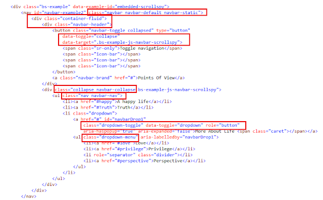
2) Designing a Scrollspy inside a Tab:
Next, we create another Tab content, containing a Scrollspy:<div class="tab-pane fade" id="profile" aria-labelledby="profile-tab">
<div class="bs-example" data-example-id="embedded-scrollspy">
<nav id="navbar-example2" class="navbar navbar-default navbar-static">
<div class="container-fluid">
<div class="navbar-header">
<button class="navbar-toggle collapsed" type="button"
data-toggle="collapse"
data-target=".bs-example-js-navbar-scrollspy">
<span class="sr-only">Toggle navigation</span>
<span class="icon-bar"></span>
<span class="icon-bar"></span>
<span class="icon-bar"></span>
</button>
<a class="navbar-brand" href="#">Points Of View</a>
</div>
<div class="collapse navbar-collapse bs-example-js-navbar-scrollspy">
<ul class="nav navbar-nav">
<li><a href="#happy">A happy life</a></li>
<li><a href="#Truth">Truth</a></li>
<li class="dropdown">
<a href="#" id="navbarDrop1"
class="dropdown-toggle" data-toggle="dropdown" role="button"
aria-haspopup="true" aria-expanded="false">More About Life <span class="caret"></span></a>
<ul class="dropdown-menu" aria-labelledby="navbarDrop1">
<li><a href="#love">Love</a></li>
<li><a href="#privilege">Privilege</a></li>
<li role="separator" class="divider"></li>
<li><a href="#perspective">Perspective</a></li>
</ul>
</li>
</ul>
</div>
</div>
</nav>

Now for the Scrollspy:
<div data-spy="scroll" data-target="#navbar-example2" data-offset="0" class="scrollspy-example">
<h4 id="happy">A happy life</h4>
<img class="img-responsive img-rounded" src="..." alt="Alternate Text" />
<br />
<p>Very little is needed to make a happy life</p>
...
<h4 id="Truth">Truth</h4>
<img class="img-responsive img-rounded" src="..." alt="Alternate Text" />
<br />
<p>If someone is able to show me</p>
...
<h4 id="love">Love</h4>
<img class="img-responsive img-rounded" src="..." alt="Alternate Text" />
<br />
<p>It is not death that a man should fear</p>
...
<h4 id="privilege">Privilege</h4>
<img class="img-responsive img-rounded" src="..." alt="Alternate Text" />
<br />
<p>You need to avoid certain things in your train of thought</p>
...
<h4 id="perspective">Perspective</h4>
<img class="img-responsive img-rounded" src="..." alt="Alternate Text" />
<br />
<p>Everything we hear</p>
...
</div>
</ul>
</nav>
</div>
</header>

That's all. The entire Tab with Scrollspy will be shown like this:
1- In Mobile devices :


2- On Medium and Big desktops:

This is the style for the App:
body {
padding-top: 60px;
padding-bottom: 20px;
}
.jumbotron h1 {
color: #a8a3a3;
}
h2 {
font: 900 18px Verdana;
color: #a8a3a3;
}
.well p{
font: 700 12px Verdana !important;
color: #a8a3a3;
}
.well-footer, .well-footer a {
font: 900 10px Comic Sans MS;
color: #a8a3a3;
}
.alert {
font: 600 9px Verdana;
}
.centered {
text-align: center;
}
.scrollspy-example {
position: relative;
height:400px;
overflow-y:scroll;
}
by Carmel Schvartzman
כתב: כרמל שוורצמן
No comments:
Post a Comment