In this Step by step Bootstrap Tutorial Lesson 6 - Responsive Modal Windows
for Beginners we explain the implementation of responsive Modal Forms, by building an App containing a Login Modal Form, for use both on desktop computers and also on all types of Mobile devices screens. This Modal Form will display Alert messages to the user using jQuery.See this in GitHub:
https://github.com/CarmelSoftware/Bootstrap_ModalWindows
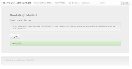
This is how this small Bootstrap App is displayed:

And this is the way how it looks in the Ripple Emulator , in Nexus Galaxy display:

Bootstrap Tutorial Lesson 6 - Responsive Modal Windows
You can start this App by working with a Bootstrap template downloaded from www.initializr.com/ (as is explained in this short Tutorial about Bootstrap Templates), or else you can start from scratch, in which case just write the following jQuery and Bootstrap references in the file's <head>:
<script src="//code.jquery.com/jquery-1.11.3.min.js"></script>
<meta name="viewport" content="width=device-width, initial-scale=1">

And the following javascript s will be located before the "Body" closing tag, as follows:
<script src="//ajax.googleapis.com/ajax/libs/jquery/1.11.2/jquery.min.js"></script>
<script src="https://maxcdn.bootstrapcdn.com/bootstrap/3.3.4/js/bootstrap.min.js"></script>


Write a <div> with id=myModal, which will be opened by the button, having class=modal fade, and role=dialog.
Now inside our <div> which will be opened by the button, we add the Form, which is surrounded by a green border here, inside a div with class=modal-body, inside another <div> with class=modal-content, inside another <div> with class=modal-dialog:


<link rel="stylesheet" href="https://maxcdn.bootstrapcdn.com/bootstrap/3.3.4/css/bootstrap.min.css">
<link rel="stylesheet" href="https://maxcdn.bootstrapcdn.com/bootstrap/3.3.4/css/bootstrap-theme.min.css">
<script src="https://maxcdn.bootstrapcdn.com/bootstrap/3.3.4/js/bootstrap.min.js"></script>
Now let's add the body contents, and start coding .

<script src="//ajax.googleapis.com/ajax/libs/jquery/1.11.2/jquery.min.js"></script>
<script src="https://maxcdn.bootstrapcdn.com/bootstrap/3.3.4/js/bootstrap.min.js"></script>

If you want to use a Mobile Emulator, getting one is explained in this short tutorial on installing the FREE Ripple Emulator.
You can download the complete app from the following GitHub repository:
1) Create a Button to open the Modal Bootstrap Form:
The Bootstrap forms will be opened by the following button , by adding a data-toggle=modal and data-target=#myModal directives, to specify how and what to open, as follows:

2) Create the Modal Form:
Our Modal Window will contain a Bootstrap Form, which we'll copy as-is from the http://getbootstrap.com Official Web Site : we remarked this Form with a green border below.Write a <div> with id=myModal, which will be opened by the button, having class=modal fade, and role=dialog.
Now inside our <div> which will be opened by the button, we add the Form, which is surrounded by a green border here, inside a div with class=modal-body, inside another <div> with class=modal-content, inside another <div> with class=modal-dialog:

Finally, the Modal Window is closed by a button using the directive data-dismiss=modal.
Also, we can close the Modal using code jQuery , with the method .modal("toggle").
3) Handling events from the Modal Bootstrap Window:
Now we write the javascript to handle the click events from the Modal Window, as follows:

As you see, here we close the Modal using the method .modal("toggle").
Also , we display a Bootstrap Alert
We also add some custom style CSS3 code for the App:
body {
padding-top: 50px;
padding-bottom: 20px;
}
.jumbotron h1 {
font: 900 25px Verdana;
color: #a8a3a3;
}
h2 {
font: 900 18px Verdana;
color: #a8a3a3;
}
.well {
font: 900 12px Comic Sans MS;
color: #a8a3a3;
}
.well-footer, .well-footer a {
font: 900 10px Comic Sans MS;
color: #a8a3a3;
}
.alert {
font: 600 9px Verdana;
}
.centered {
text-align: center;
}
That's all. Our Modal Window will be displayed this way:
1- In Mobile devices :


The display for Nexus Mobile devices screens is as follows:
2- On Medium and Big desktops:


by Carmel Schvartzman
כתב: כרמל שוורצמן
No comments:
Post a Comment